Introduction
Kevin needed a website to clearly present him and display his work and a variety of projects he worked on. Most of his projects were in his github repository which is not very inviting for people who are not familiar with the platform, and overall looks a bit cryptic.
Process
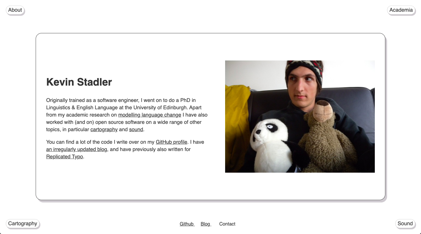
After talking with Kevin and sifting through his github it became apparent that he had 3 main topics: academia, cartography, and sound, so we sorted his projects in these 3 categories. Since he also wanted to have a clear statement about who he is, this gave me 4 parts that would make the basis of the menu. Since he has such an avid interest in cartography I wanted to incorporate this somehow in the design. The connection between 4 parts and 4 main sides of the world important for navigating, appeared intuitively to me so I placed the menu elements for the 4 parts in the corners of the screen, and decided to have the projects in the middle of the screen. After showing the initial design to Kevin he pointed out right away how it reminds him of 4 sides of the world.
Tools and skills
design, HTML/CSS, JavaScript