Tools and skills
JavaScript, HTML/CSS, github, documentation
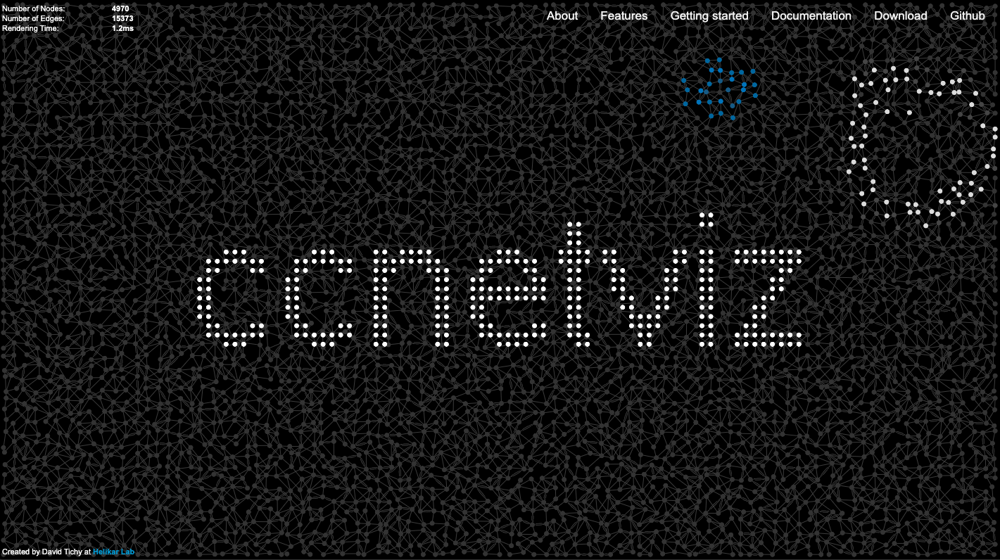
As part of Google Summer of Code 2018 I worked on a Javascript/WebGL library for interactive visualization of large-scale network graphs - ccNetViz. The goal was to add new examples for the ccNetViz library, make a benchmark performance framework (which compares the ccNetViz library with Cytoscape and SigmaJS libraries) and create a new webpage. I will focus just on the web page in the further text.
The goal was to create a simple webpage that will clearly show the main features of the library, getting a starting guide and documentation of the library. Additionally, some of the examples were broken or didn't have a clear interface for using them, so this needed to be fixed.
I chose a nice visualization of a network as the first thing that can be seen on the website with the name of the library over it so that the visitor could get an idea of what the library is about and hopefully remember the name. From there you can either scroll or choose where you want to go from a menu, depending what is more intuitive to you.
The examples for the library were not consistent in style and some of them were hard to navigate.
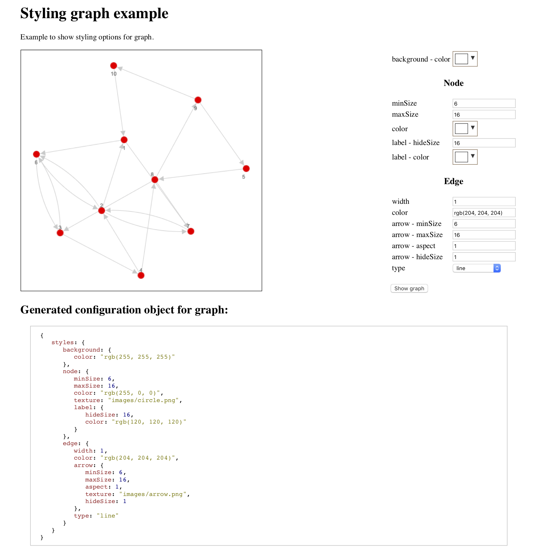
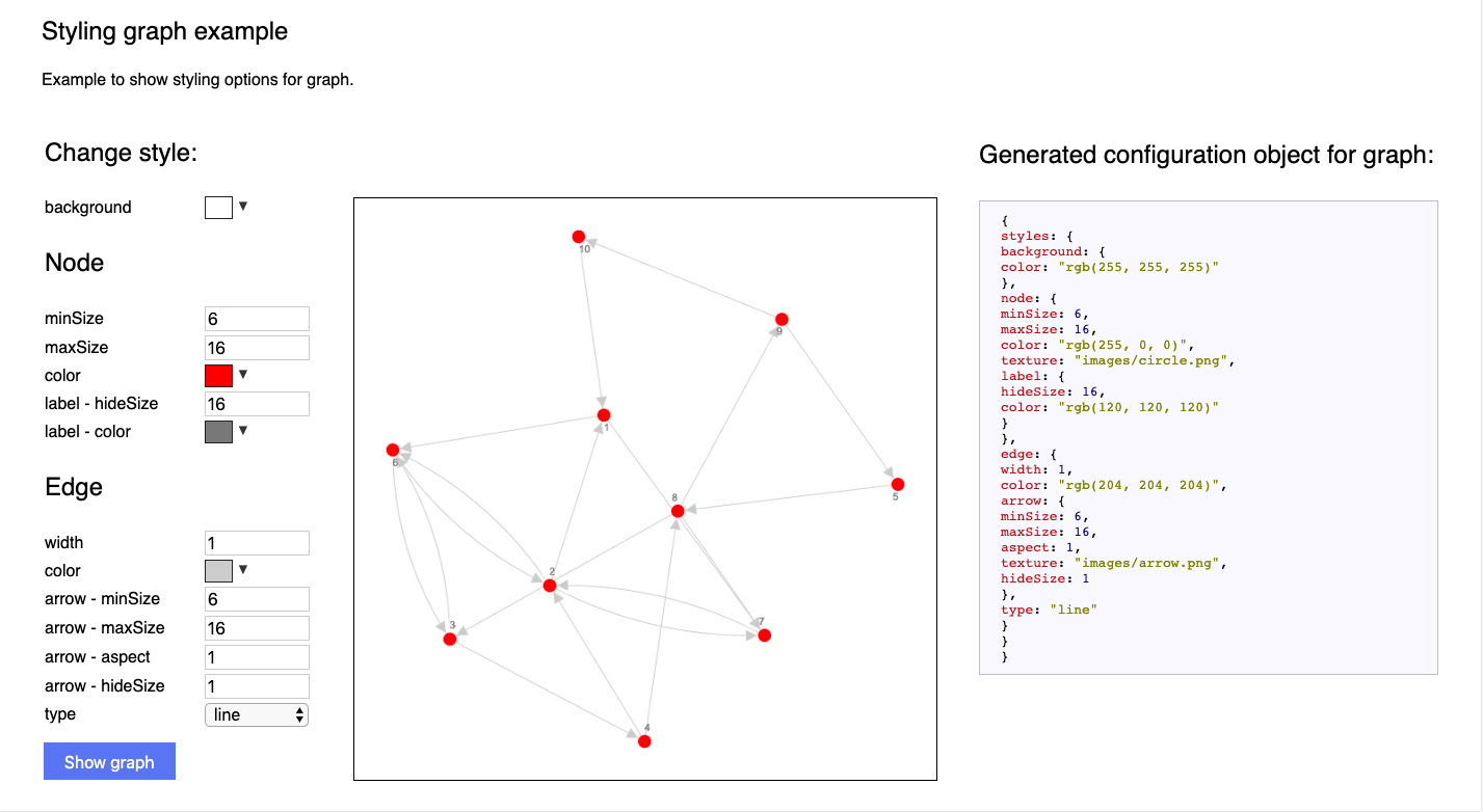
For example, "Styling graph example" is giving the opportunity to the user to choose the styling options and then with a press of the button they can see how the graph would look like and also get the code which can then just be copied. The initial layout had the graph on the left side, options further on the right, and the code beneath. Since the use case for this example is a user who just wants to choose styling options, see how they look and copy to their own project, it made more sense to design the example first and foremost for the desktop as it wouldn't make much sense to use this on the mobile, I created the layout in such way that the user first chooses the styles, see the image and has the possibility to copy the code, without the need to scroll further.
I also fixed the UI layouts for all the examples as elements were not aligned and appeared too chaotic to navigate. I kept the color palette to black, white and blue. The blue was used to accentuate interactive elements.
The website has changed since I've worked on it, but you can still see the version implemented by me on my git.
JavaScript, HTML/CSS, github, documentation